

As mobile phones become an integrated part of our life, it seems there are many variations and user-friendly apps are making the app market. As there are so many apps in the market it will be difficult to differentiate from another app on just functionality.
Apps are improvising on UI & UX design and without good design user will not prefer that application. As design strategies improve, user preferences to use application changes. It’s just not color for your application, the app developer needs to define a theme for the application.
When you about to start designing your app you need to define color schema first. It will have a long-lasting impact on overall user experience and easy to maintain application branding.
We have 2 options to choose when we start designing.
- Light Theme
- Dark Theme
What is the light theme?
Light theme is quite commonly used in most of the app. A light background or theme is preferably used where the readability of website or app is heavy or more.
What is Dark theme?
When you want your users to focus on a particular thing or item dark theme can be a good option for it. Dark theme background will always allow you to create a distraction-free layout and keep users attention on a particular item.
What are the characteristics of the Dark theme?
- Dark themes are dramatic, stylish and elegant.
- It allows us to design layout with few elements and space them well.
- It can highlight the core elements of a website or app which gains users attention.
- It also gives the feeling of purity, simplicity, and sophistication.
What are the characteristics of the light theme?
- Light themes are common and familiar for us as we use it in our day to day life. Example – Whatsapp, Swiggy.
- It has a powerful psychological pull, invoking thoughts of cleanliness, modernity, and efficiency.
- It can highlight the core elements of a website or app which gains users attention.
- Sometimes dark theme gives negative vibes as it conveys a feeling of depression or sadness.
When to use a light theme?
- When your website or app will be used in the day time. Example – Kindle ( Book reading app)
- When mobile app or website has more reading content or mixed content. Example – Facebook, Twitter, Instagram.
- When apps contain a lot of forms, components, and widgets like a banking app.
- When a design calls for a wide range of colors.
When to use Dark theme?
- When there is less text to read and more images or videos to watch.
- It is appropriate to use a dark theme when you want to create a feeling of mystery, luxury or a dramatic look.
- Majority of entertainment-related UI’s tend to have a dark theme as they are used in the evening or watched in a dimly lit room. Example – Netflix, Amazon Prime, Hotstar, etc. Google maps are the best example of dark theme as it automatically changes to dark theme as time changes from day to night.
What color schemes are used Light theme?
First of all, let’s see what are the primary colors and secondary colors and tertiary colors.
- Primary Colors – Primary colors are a group of colors from which all other colors can be obtained by mixing. Red, Blue, Yellow are primary colors.
- Secondary Colors – Secondary color is a color resulting from the mixing of two primary colors. Purple, Green, Orange are Secondary colors.
- Tertiary Colors – Tertiary is the resulting color formed when an equal amount of a primary and a secondary color are mixed. Red Purple, Purple Blue, Blue Green, Green Yellow, Yellow Orange, Orange Red are Secondary colors.
Now we will see the color schemes which are generally used for designing light theme.
- Monochromatic Color Scheme – It is derived from a single base hue and extended using its shades, tones, and tints. Tints are achieved by adding white and shades and tones are achieved by adding a darker color, grey or black.
- Analogous Color Schemes – It uses colors that are next to each other on the color wheel. They usually match well and create a serene and comfortable design. Analogous color schemes are often found in nature and are harmonious and pleasing to the eye.
- Complementary Color Schemes – Colors that are opposite each other on the color wheel are considered to be complementary colors. The high contrast of complementary colors creates a vibrant look, especially when used at full saturation.
- Split Complementary Color Schemes – The split-complementary color scheme is a variation of the complementary color scheme. In addition to the base color, it uses the two colors adjacent to its complement. This color scheme has the same strong visual contrast as the complementary color scheme but has less tension.
- Triadic Color Schemes – A triadic color scheme is comprised of three colors evenly spaced on the color wheel.
What color schemes are used Dark theme?
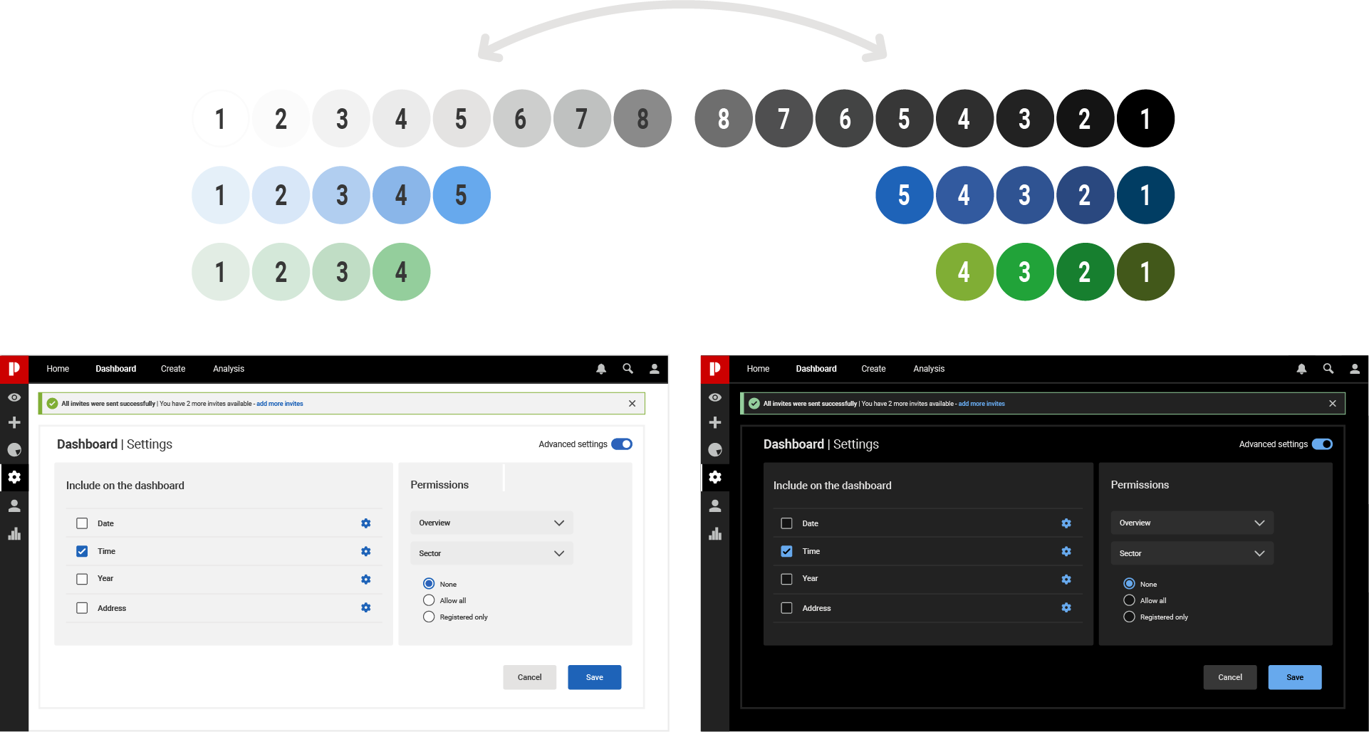
The dark theme doesn’t mean to have pure white text on pure black background. In Fact that high contrast can look awful or unpleasant. We cannot use the same colors that we use in light theme, but only one color from those and its less saturated shades i.e % of white should be more.
It is better if that will be brand color as it keeps your product identity. For example, if we use red blue green colors in white theme then you should only use one brand color while designing a dark theme. Dark theme and a light theme will evoke different emotions and feelings. The dark theme cannot give the same look and feel it a light theme.
Finally, before you start app designing find the best way to represent your idea to your audience. Not only design but characteristics of light theme and dark theme should be chosen wisely.
